|
|
CSpace
WebSite Intro ▪ What is CSpace? ▪ Download ▪ Tutorials ▪ FAQ & Bugs ▪ License ▪ About us |
Ternary Feldspars
Practical subjects covered:
Support files
This tutorial develops a simple example whose goal is graphical inspection ternary feldspar relationships within the CaO-Na2O-K2O(-Al2O3-SiO2) system. The data is a fairly large set of compositions (atoms pfu) of coexisting plagioclase and alkali feldspar, calculated at 6 kbar and three temperatures (750, 800 and 850ºC). In turn, each of these is estimated using two different mixing models (Fuhrman and Lindsley abbreviated FL, and Elkins and Groove, abbreviated EG).
This step requires that you have installed Excel or any other spreadsheet that can read the provided Excel worksheet file. Otherwise, proceed directly to the next step.
When dealing with large datasets it is particularly important that a way is found to import the data to the CSpace environment (that is, into the Datasheet), rather than have to type all from scratch. There are several ways in which this could be done, the easiest being using the Paste as New File command. The one thing this command requires is that you copy the data to the clipboard in suitable format, and is particularly appropriate whenever the data is already contained in (or can be read into) a spreadsheet.
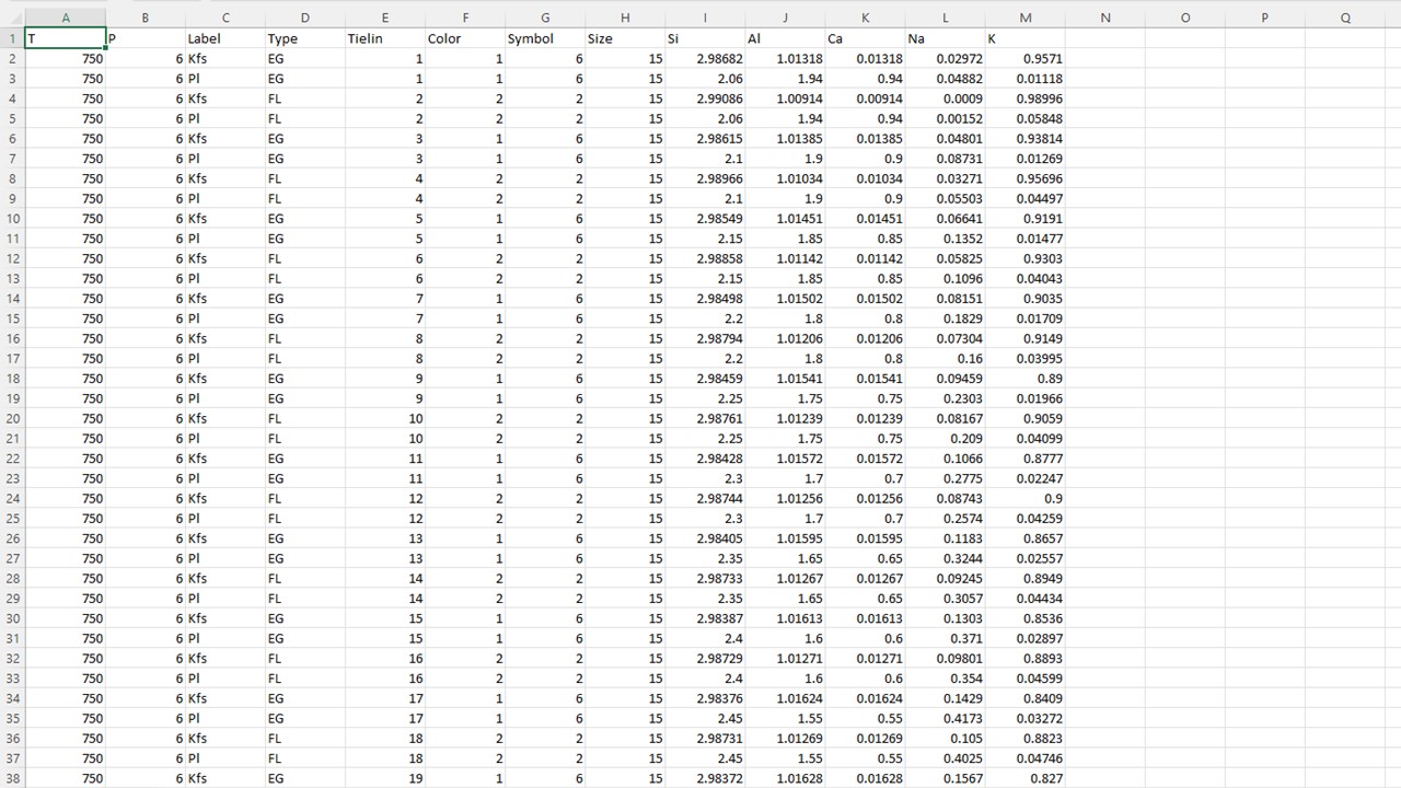
To see how Paste as New File works, examine the provided Excel spreadsheet, TernaryFld.xlsx. It should look like this:
As shown, the data should be organized as a table of variables (columns) and cases (rows). Notice also that the table has one first row that contains variable names. This is important because the Paste as New File command expects finding variable names in the first row of the table.
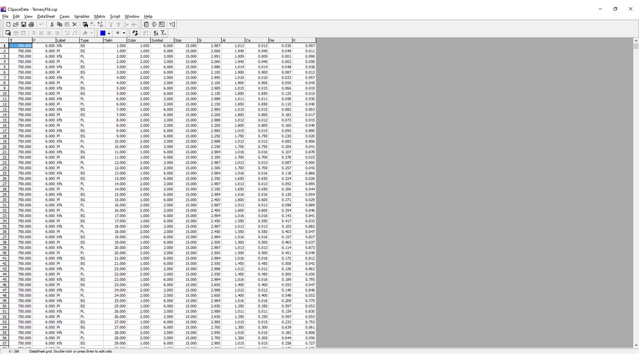
The rest is easy: select the whole table in the spreadsheet, copy it to the clipboard, then switch to CSpace and choose Edit/Paste as New File. CSpace will create a new datasheet that holds the spreadsheet table, everything in place, as illustrated below:
Tip: The Paste as New File command makes practical using all the powerful capabilities of your spreadsheet to generate CSpace input, as in the above example.
If you didn't follow the first step of the tutorial, please open CSpace and load the example data file TernaryFld.csp.
Whenever a new file is loaded, CSpace's default behavior is to "connect" it to the graph engine, then try locating suitable plotting variables so that a default plot is automatically setup. This is done for variables named Label, Symbol, Tielin, Color and Size which, if found, are pre-selected for the corresponding formatting purposes. The first four system variables in the file are preselected as plot variables. In this case there is none, so no system variables are selected automatically. It must be done by the user clicking "Tag All" in "Cases" and use the combo boxes in the Graphs window so that K is selected in the A apex, Ca in B, Na in C and Si in D. At this point, a tetrahedral plot (default) of the data would have this appearance (note that the cases are shaped (symbol), labeled, colored and tied with lines automatically; if you do now wish them, instruct the graph engine to use the other values or existing variables for that purpose. To do this, use Symbols button in the Graphs window):
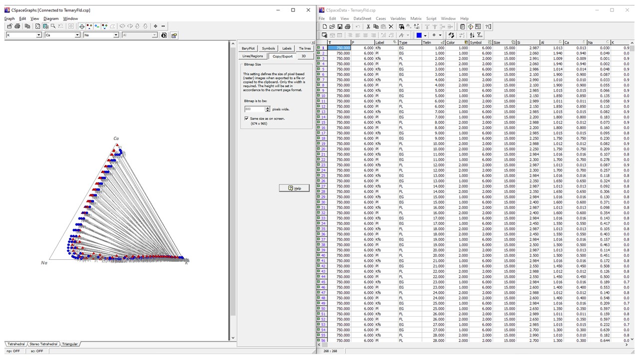
And the triangular plot of the data would have this appearance:
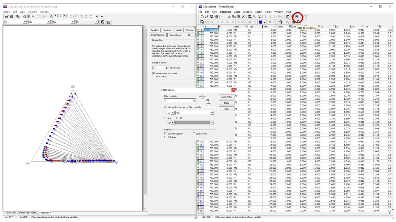
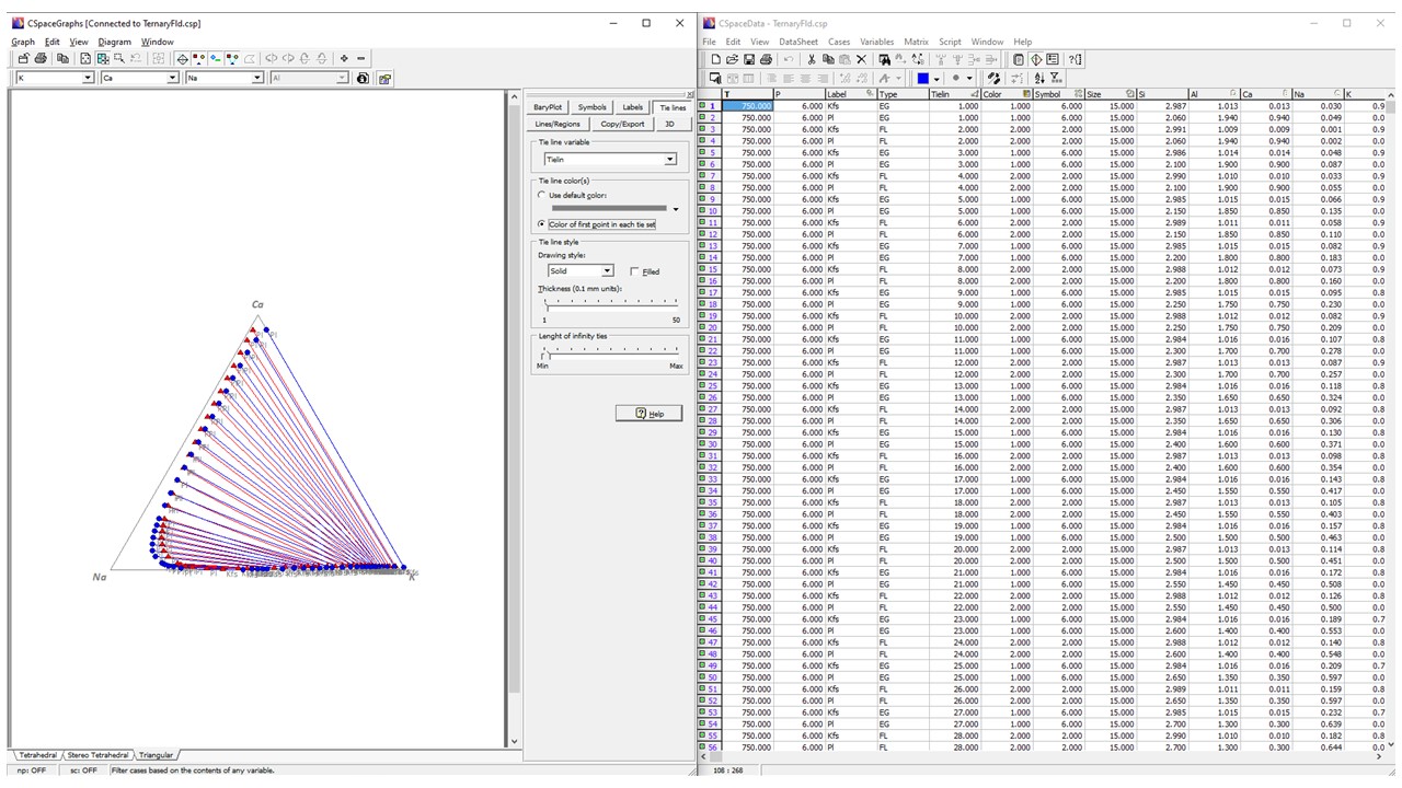
Because all cases are included in the plots, the display is fairly cluttered. Assume we want to inspect the calculated equilibrium compositions at one given temperature (say 750º C), and compare the results of different mixing models. All we have to do is to exclude the cases where the temperature (given in variable T) is different from 750. We could do that manually, by means of the Include or Exclude commands in the Cases menu, but using the Filter command is far more efficient as illustrated below. Once you press Apply Filter in the Filter dialog, all points corresponding to cases at temperatures different from 750 degrees are excluded from the plot. This results in a cleaner plot:
In the "Tie lines" button of the Graphs window, select "Color of first point in each tie set". Now tie-lines are colored as the symbols:
In the View labels button of the Graphs window, toggle (hide) labels:
Notice that any changes in the Graph Settings are immediately reflected in the plot. You do not need to close the Graph Settings dialog for any changes to be applied, and that allows you to keep it permanently open if your screen size allows.
Now it allows a clear distinction of the two datasets. What happens under the hood is that, once a variable is chosen for a given formatting purpose (shape, size or color), each point in the diagram is drawn according to the value of that variable for the corresponding case. Symbol shape or color values, for instance, are interpreted as symbol or color codes (from zero to 14). If you inspect the data file, you will find that dataset "FL" is using symbol 2 and color 2 (a blue circle), and dataset "EG" symbol 6 and color 1 (a red upward triangle). However, selecting specific symbols and colors in the corresponding is more convenient.
The equilibrium pairs of alkali feldspar (Kfs) and plagioclase (Pl) within the "trivariant" region of the plot are seen by means of tie-lines connecting each of these pairs. Setting up a tie line utility variable allows automatic drawing of tie lines among all (and up to four) cases sharing the same tie marker (any alpha-numerical code). Once the variable is selected in the Tie Lines page of the Graph Settings dialog, tie lines can be shown or hidden by choosing View/Tie Lines in the Graphs window (toolbar button). In the Graph Settings dialog you can also specify that tie lines have either a customizable default color, or adopt the color of the first point in each tie set. Ensure that the latter option is chosen. The plot is now complete, with red and blue tie lines connecting each pair of equilibrium feldspar composition
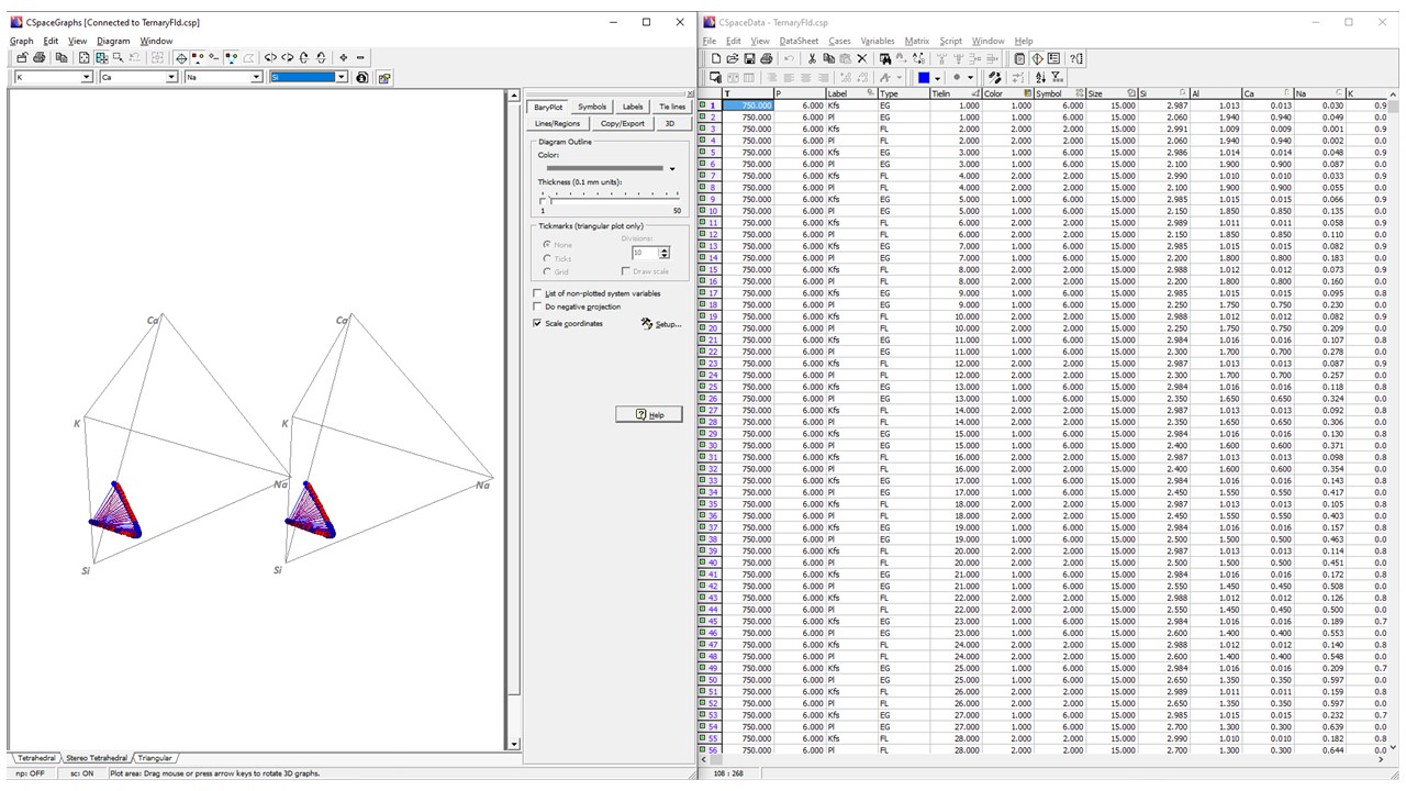
Ternary feldspar relations can be fully described in a ternary K-Ca-Na diagram as in the previous illustrations. Yet, for the sake of experimenting, switch to a Stereo Tetrahedral quaternary diagram that includes Si as a the fourth component:
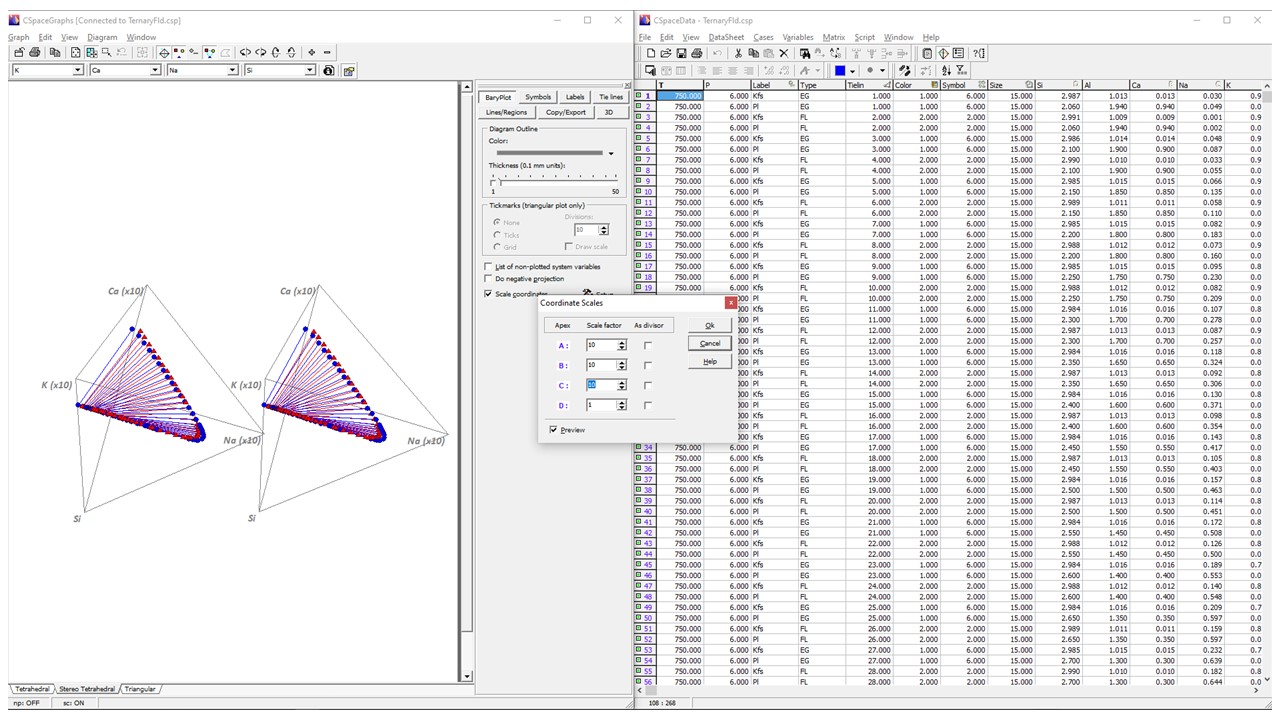
As expected, feldspar relations restrict themselves to a plane within this space (have a stereoscope at hand?), yet it is hard to see that clearly because that plane is located near the Si apex, making inefficient use of plot volume. One solution would be to scale values so that points locate farther away from the Si apex. Scaling amounts to re-defining the units quantities by which components are expressed, hence has no influence in overall relationships. Coordinate scaling is directly supported by the graph engine of CSpace, which even lets you instantly switch between scaled and non-scaled views.
Coordinate scaling must be setup in BaryPlot > Scale Coordinates Setup in the Graphs window to invoke the Coordinate Scales dialog, then enter the apex scales as shown in the figure below and press the OK button. Configuring coordinate scaling does not produce any visible results unless coordinate scaling is active. To activate/deactivate it, click in Scale Coordinate which acts as a toggle between both states.
Notice that apex labels now display the scales applied to each, so that you can tell that scaling is active and what is the scaling being applied at any moment.
Experiment further
Experiment with the Filter command to inspect the other compositions sets in the data file. Could you devise a plot displaying equilibrium compositions at the three different temperatures? If you have or can get actual data of coexisting two feldspars (say, a from a granitic rock or an experimental run), it is an easy task to include them in the data file and compare the calculated and actual compositions of the minerals.
Back to Tutorials


last modified: 03.01.23 20:03 +0100